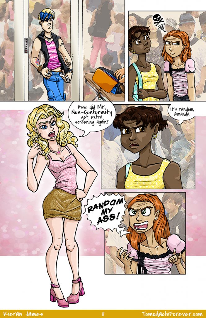
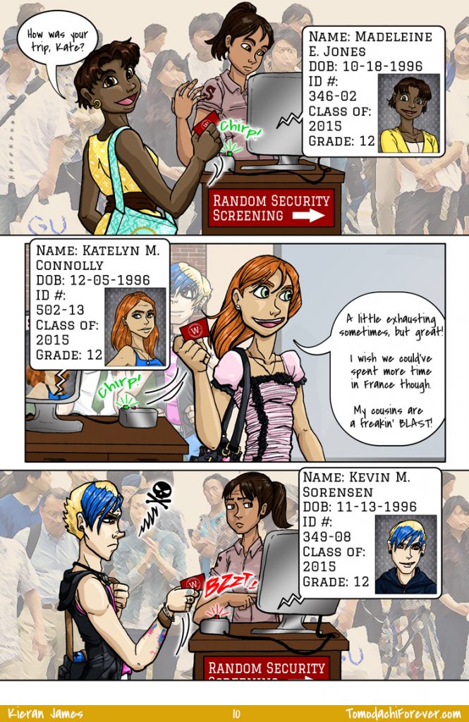
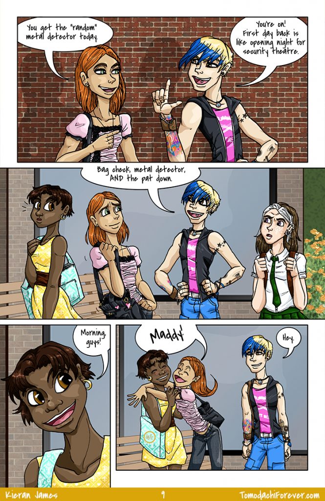
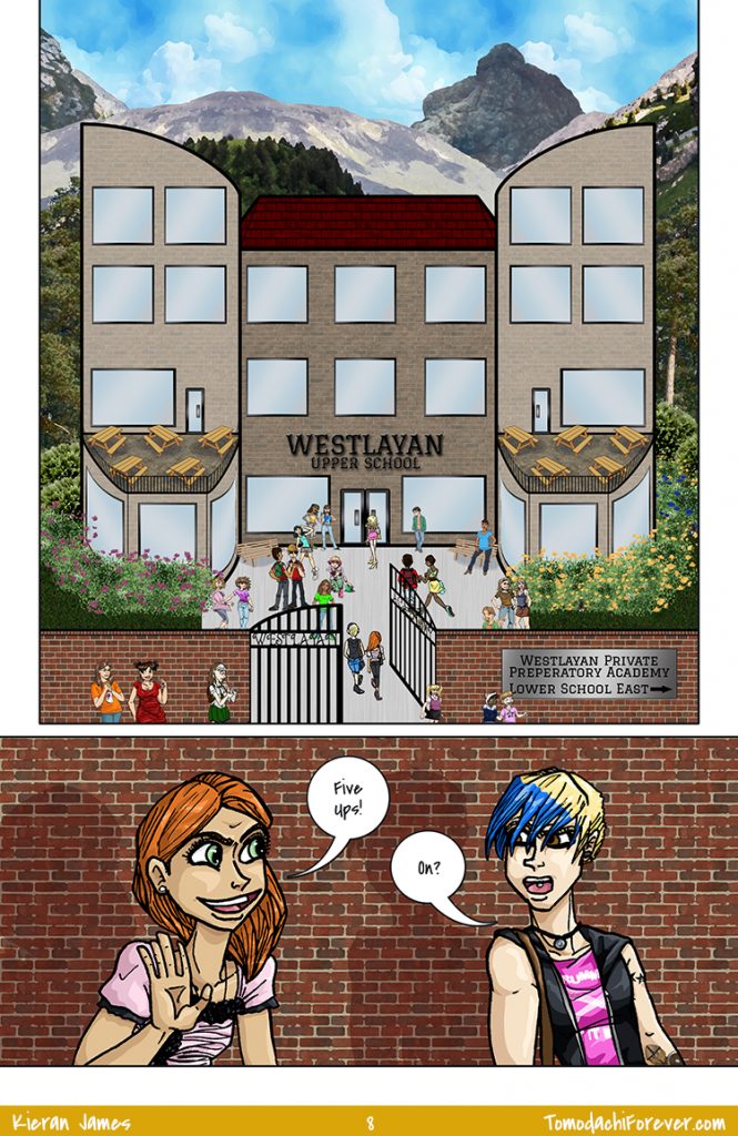
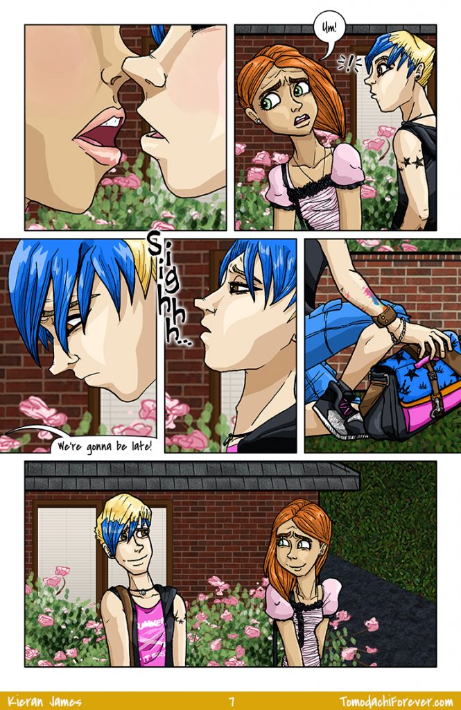
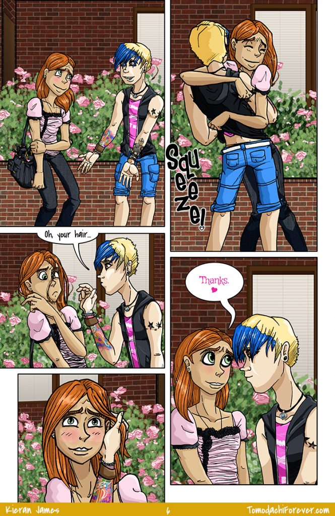
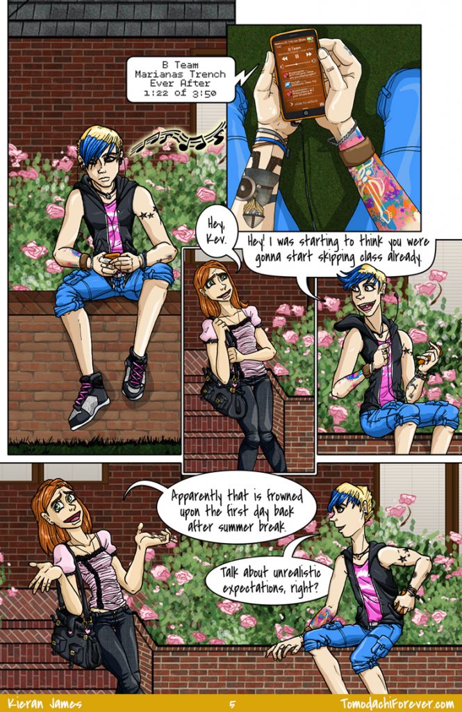
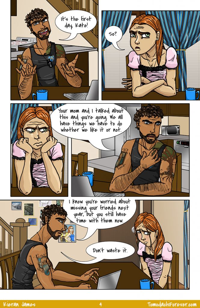
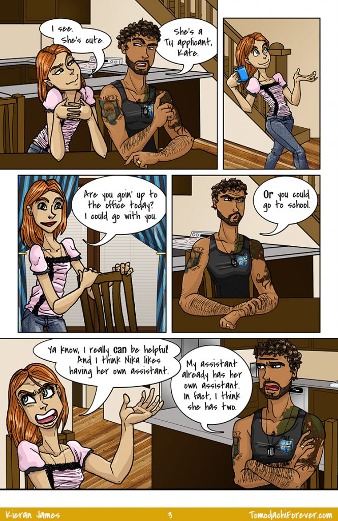
You may have noticed by now that Kate is super rational and not remotely prone to mood swings, outbursts, or melodramatics.

Archive for Kate – Page 4
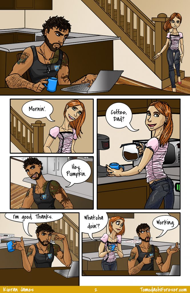
I’m especially proud of panel 2 on this page. Did you notice that everyone has a different nose?! It’s true! I noticed reading Friends With Boys by Faith Erin Hicks that all of her characters had adorable, distinct, and distinctly adorable noses. I tried hard during final character designs to take something from that and branch out a bit. Hope you like it!
The establishing shot of the school is pretty much the longest I’ve ever spent on a single “panel”. Definitely sick of it already!
The best part about this page was when my WordPress media library broke while I was trying to upload the update. Apparently WP 3.8.1 and the AJAX Rebuild Thumbnails plugin don’t get along so hot and will throw a super helpful error: An error occurred in the upload. I rebuilt the meta data first, then tried to rebuild thumbnails using AJAX since I already had that installed. No dice! More searching revealed that AJAX has a conflict with WP 3.8.1 so I deactivated that and suddenly the media library and featured images were working again. Woot! Super important since otherwise y’all ain’t gettin’ comics. Here’s a WP forums thread on it if anyone else has the same issue with their wordpress site.
You don’t want to know how many hours this page took me to knock out. I also spent a huge amount of time working on the exterior of the house, most of which is not in any single shot here. Because of course not. Those stairs and that planter also kind of kicked my butt because things made primarily out of straight lines are apparently way harder for me than, say, human beings.
Go figure.
Seriously, Kate? That is a top-notch pretty princess pout, though.
I had to make an extra background for panel 5, because flipping the panel art just didn’t flow right. Besides, we’ll eventually be back in the kitchen some day anyway, so may as well make that backdrop now. My reasoning for doing all the stupid little collage frames is far less reasonable though. That was pretty much, “Gee, this wall is kinda empty. I bet they’d have photos up – let’s do that!” You know, so that I can cover it up with word balloons, because I manage my time super-efficiently.
Hey, you can totally kinda, sorta (not really) see two characters we haven’t met yet! …The third is under the word balloon, and I spent a ridiculous amount of time finishing the art I used for that frame so, like, fuck this shit, right?
Right.
Considering how much I HATE drawing trees, you’d think I wouldn’t decide that Sam needs to have a ginormous tree tattoo on his arm. Also, that we need to see it because it’s summer. “Maybe it’s not too warm yet for him to wear long sleeves. In August. In Colorado.”
Yeah, no.
Fun fact: Sam has one more tattoo that’s not visible here. Ooooo!
Thankfully the third page takes place in the same set, so that’s a relief. Page four ALSO takes place in the kitchen! Oh, how I spoiled myself when I wrote this. (Page five requires not only a new set, but it’s outdoors and has A: architectural elements, B: landscaping. This is what I get for forcing myself to write the story without regard to how hard any aspect may be to draw.)
I’ll probably post a full version of Sam’s tattoos soon. That tree took hours. I did the full thing and then applied it to the character on a Multiply layer, and transformed as necessary for size, skew, warping, etc. Fun! I’m pretty excited with how well that works – trying to draw and color tattoos every page would be insane and they wouldn’t look as good. Too tiny to get that much detail!
Copyright ©2014 Kieran James
All Rights Reserved
Designed by Studio Brassy
