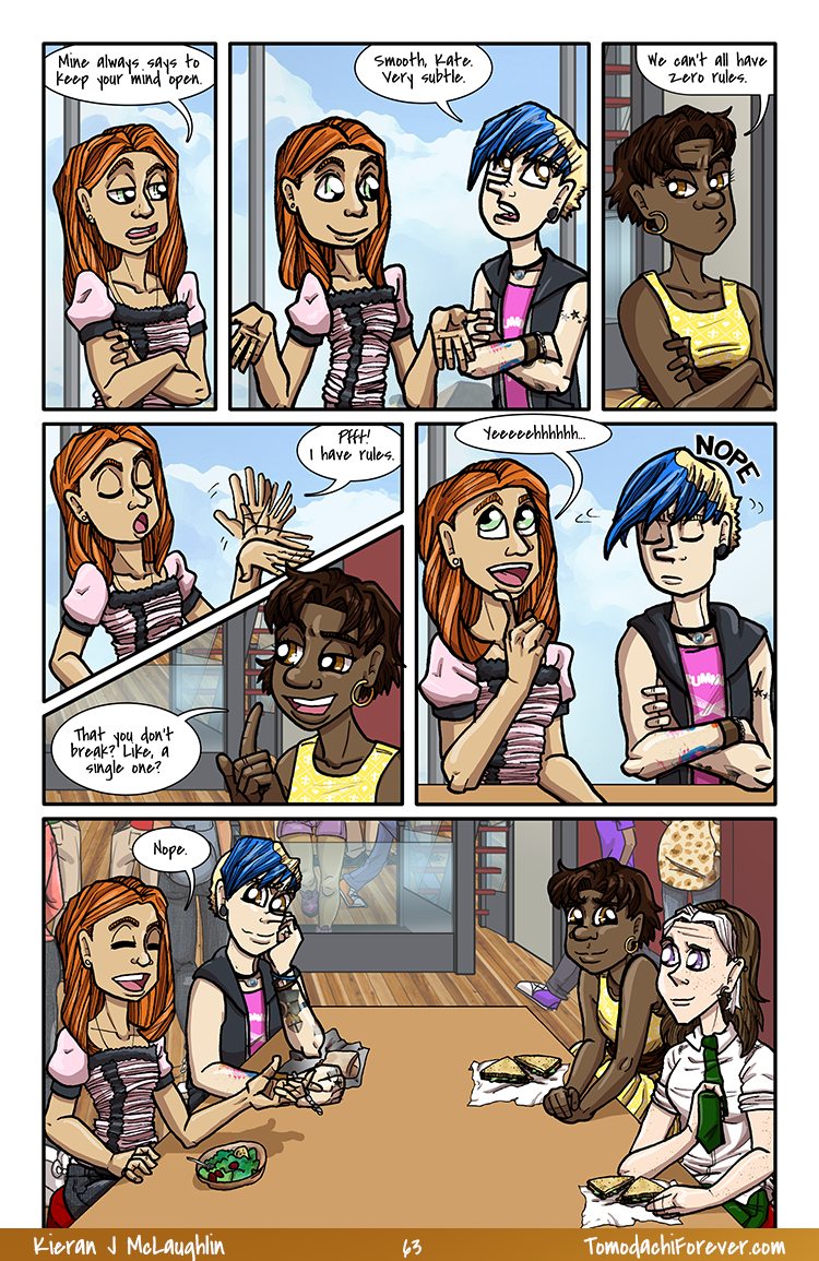
Last page of chapter 3, so obviously I just had to use an angle in the last panel that I didn’t already have a background for.

I shared the work in progress of this one earlier this week and now she’s dooooonnnee!
Carla is a spunky, badass trans girl from David Willis‘s current webcomic Dumbing of Age. She frequently wears roller skates and zips around being freaking awesome, so I had an incontrovertible need to draw her playing Roller Derby.
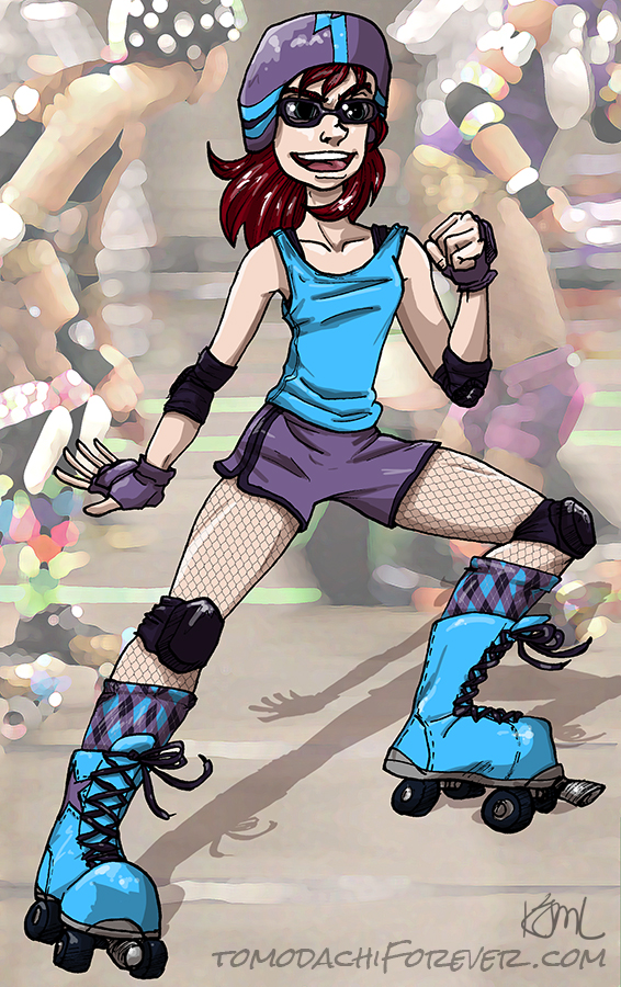
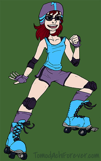 Happy Sunday, gentlefolks! I’m fighting off a ~truly devastating Man Cold~ right now, but the next Tomo page is inked up and ready to get scanned and colored. In the meantime, have some work in progress fan art to tide you over.
Carla is a spunky, badass trans girl from David Willis‘s current webcomic Dumbing of Age. I put her in a pair of skates for derby (and some sports goggles since she wears glasses).
And here’s my favorite Carla strip.
Save
Save
I wanted to share some of the tattoos large scale awhile ago, but I’ve been very busy lately. Here is the tat on Sam’s right shoulder. It reads “Tsuyar Hljoðr Moð”. No, I’m not going to tell you what it means. That would be cheating!
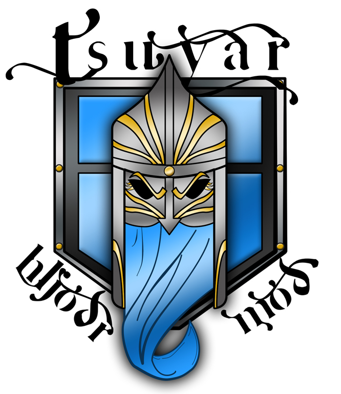
I have this saved as a 300 dpi transparent background image so when I need to use it I copy it as a new layer, size and transform, then set the layer opacity to 85%. Works like a charm!
My 3 year old son was recently in the hospital for 4 days, at the same time both my website went down for 3 days, my garbage disposal broke, the back-up caused a leak through the kitchen into the basement, and the door knob on our back door broke, meaning every time you shut the door there was a greater than zero chance it wouldn’t open up again without power tools, so hopefully you hadn’t just walked out into the yard. Or if there was a fire – not being able to leave would be super inconvenient.
It was a rough couple of weeks.
I’m currently shading tomorrow’s comic, which has been a bit of a pain for a variety of reasons.
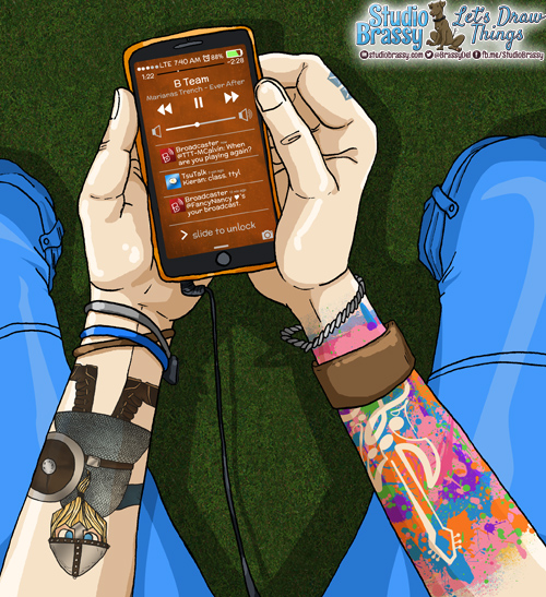
1: architectural elements. You have no idea how many hours I spent working on the exterior view of the McLaughlin townhouse, though I’m pretty sure most of it isn’t going to fit on the pages so HA ON ME. Let me just spend hours on these details you’ll never see.
2: panel layouts. As I was drawing the actual comic art I went back to the layout and scrapped it. I’m still not entirely sold on the final layout, which is okay since I do each panel’s lineart separately, but it’s still a stressor. I like art BIG and I have to ram enough detail into each panel without scrunching up the text. I also have a hard time reading small text myself, so I think I do the dialogue at too large a font size. What do you guys think? Legible so far? Too big, too small?
3: I’m an idiot. So there’s a phone screen in this panel, and it’s tilted at an angle, because holding your phone at exactly 90 degrees would be a little odd. Being a genius, I transformed each layered item individually to try to line them all up at the exact same angle. I probably spent an hour or more just on the phone, since I also had to do all the little icons and other graphics for it, including developing app icons for Broadcaster and TsuTalk. After I was done it occurred to me that a smarter individual would have done a normal, straight version of everything with copious ruler guides, and then flattened it, copied it, added to the panel, and THEN transformed once to angle it correctly. Well. Now I know.
4: Those freakin’ tattoos! Kevin has a lot of tattoos, at least for a 17 year old. The viking took a long time and the paint splatter guitar took far longer than you’d think as well, especially since I did three takes on it. I’m happy with them now, so if you don’t like ’em… shut yo’ mouth, baby!
So the purpose of this post, on a lovely Sunday morning when I should be shading another panel right this second, is that I just finished this one panel and I really wanted to show it off. Hey! Look at that GRASS! And those shadows on the grass that I totally forgot to draw at first! But they’re there now! Anyway, enjoy!
As I was working on next Monday’s page, I noticed something.
First, my layout doesn’t exactly match the script. The panel set up was pretty, but didn’t flow coherently. In fact, I screwed up the flow in an exact way I have screwed up panel flow before, so really… What was I even thinking?!
Most likely, I simply wasn’t. So after some swearing and frowning and editing, I fixed the panel layout for page 3. Then I noticed another itty bitty pencil note on the figures…
An arrow and tiny text… “Ring”.
Because I am an idiot (and because my husband and I don’t actually have wedding bands), I forget little details like putting Sam’s wedding ring on his finger when his left hand is visible. Pretty much every single time I draw him.
At this point I just went…
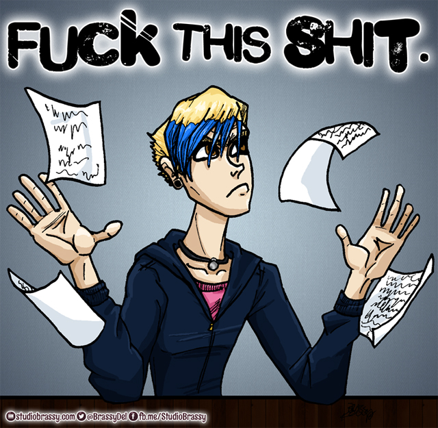
Yes, thank you Kevin! Fuck this shit, indeed.
In case you were curious, I did already fix Sam’s hand on page 2 and uploaded the corrected image. Resized for the web, his ring is approximately 2.3 pixels across, so that was definitely time well spent! Rockin’. Also, it’s gold so it kind of blends into his finger at that resolution, but if you squint you’ll see it’s totally there. Promise.
Tomodachi Forever is the very few people you’ll risk getting shot over. First page goes live TOMORROW!
Tomodachi Forever isn’t just love.
It’s war.
Copyright ©2014 Kieran James
All Rights Reserved
Designed by Studio Brassy
