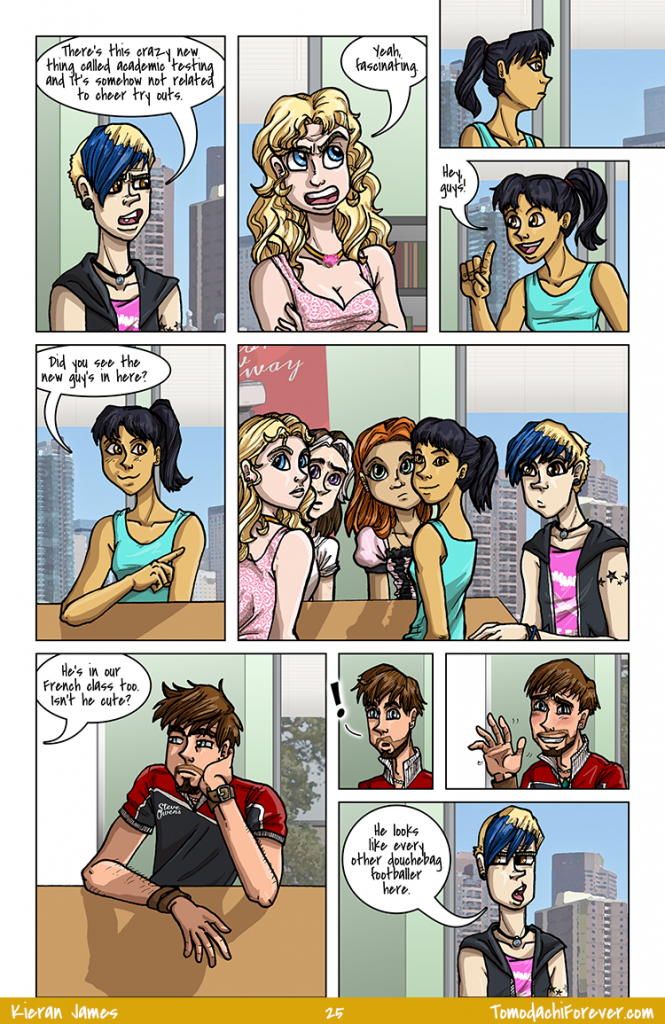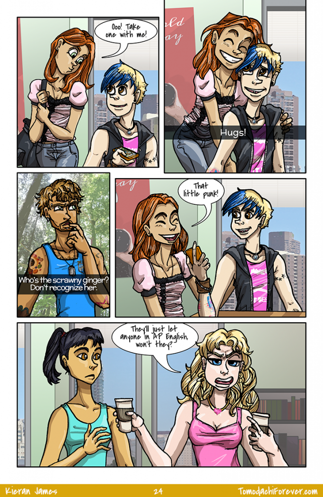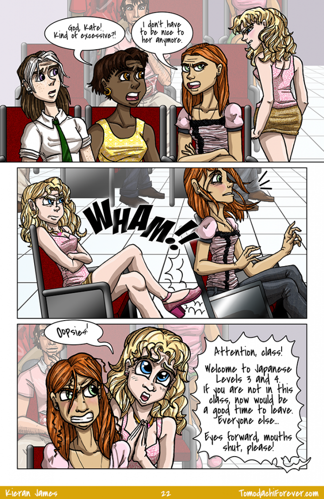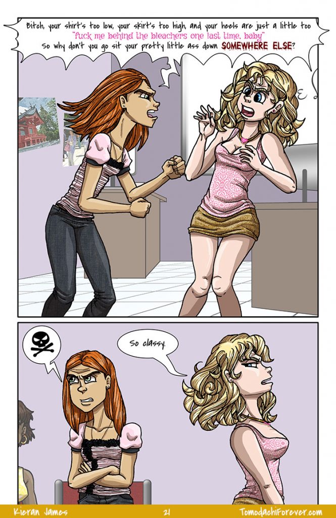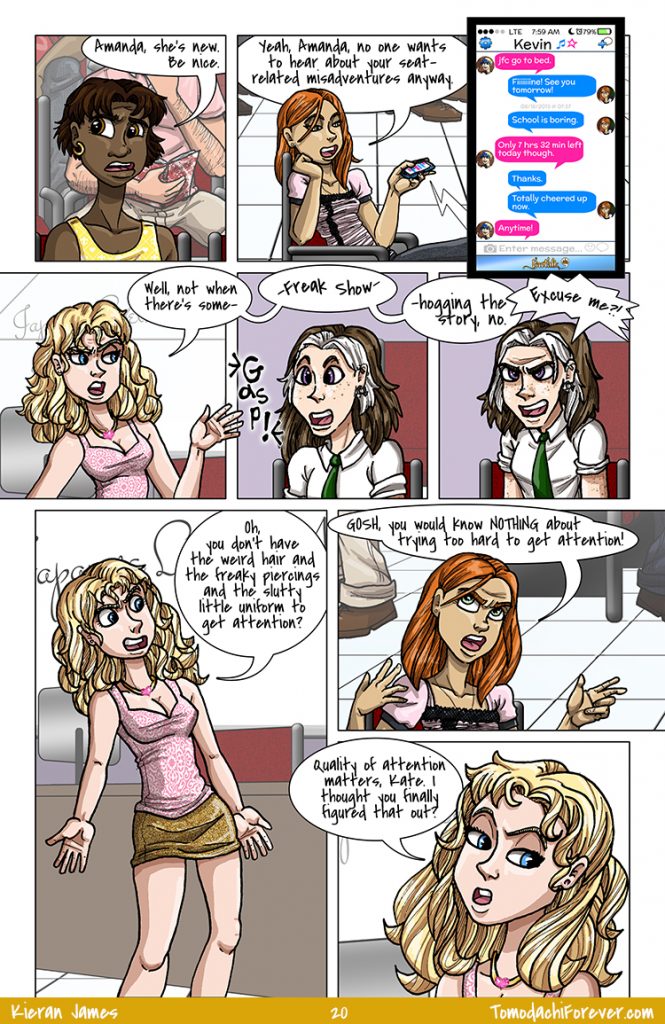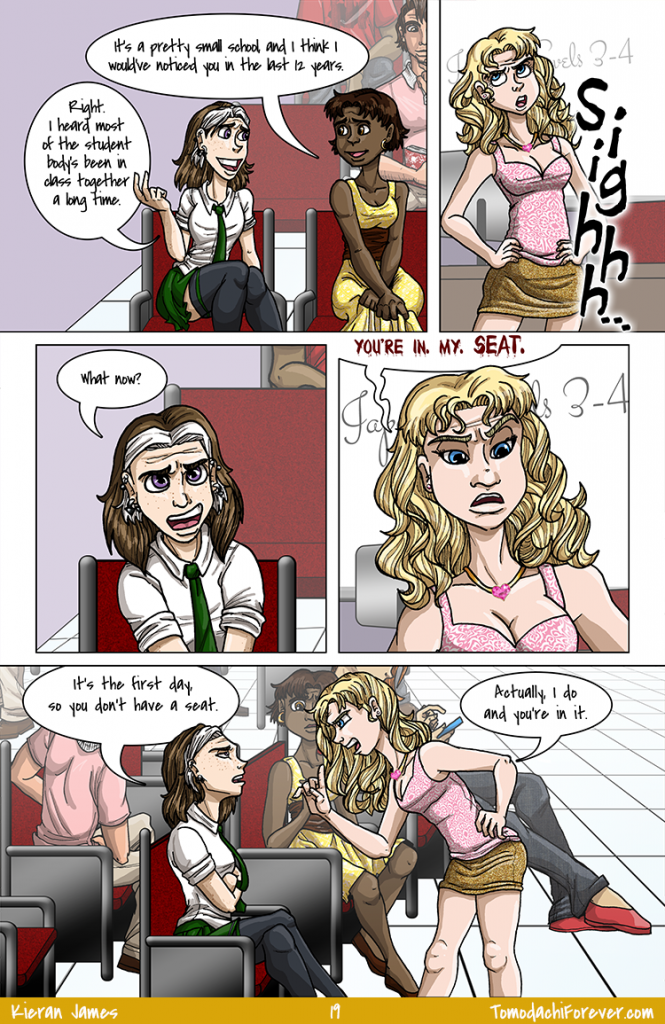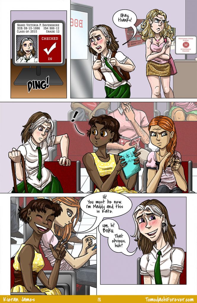

Someone should totally start a tally of how many times people blush in this comic. Probably by character rather than just a sum total because it’ll be a really neat visual after awhile. Of course, now I’m thinking about “who NEVER blushes?” and I think there may be a few folks. So either we don’t see them very often, or perhaps I haven’t done a great job with their emotional range since blushing happens for a few different reasons…
Can you guess yet who on this page blushes the most and who blushes the least? I’d love to hear your guess!


I had to do the backgrounds twice because I realized after the first time that I had oriented the room wrong. I built a 3D model of the school in Sims 3 several months ago, specifically to save me from this sort of thing. Otherwise I’d just be guessing all the time and every building would have Escher-style architecture.
I actually tried building sets in Sketch-Up so I could use filtered screenshots for backgrounds, but the learning curve was way to high for the amount of time and patience I had. Instead I plan spaces out in Sims and then draw them in Photoshop. Works well so far! My goal is to be able to reuse a lot of backgrounds. Even though there’s a ton of different set locations, most of them come up in multiple scenes.
Oh, and I was thinking I’d release the Sims-created sets for download, though I’m not sure how much interest there would be. I did, of course, create Sims versions of the characters as well, to, uh, test the buildings. Yeah, that’s it.


Oh, Amanda! Such a doll.
Just FYI, Kate is never wearing that damned ruched shirt ever again. It’s easy enough to shade, but a total pain in the derriere to color. That grey charcoal strip along the top and one side has lots of little lace lines so selecting around that area is time consuming. Sure is pretty, though.

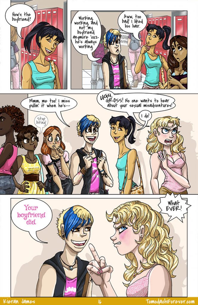
Oh my gosh, I bet these two are, like, super close! Totes BFFs, right? They could be sisters!

Somebody here’s got some serious heteronormative issues.

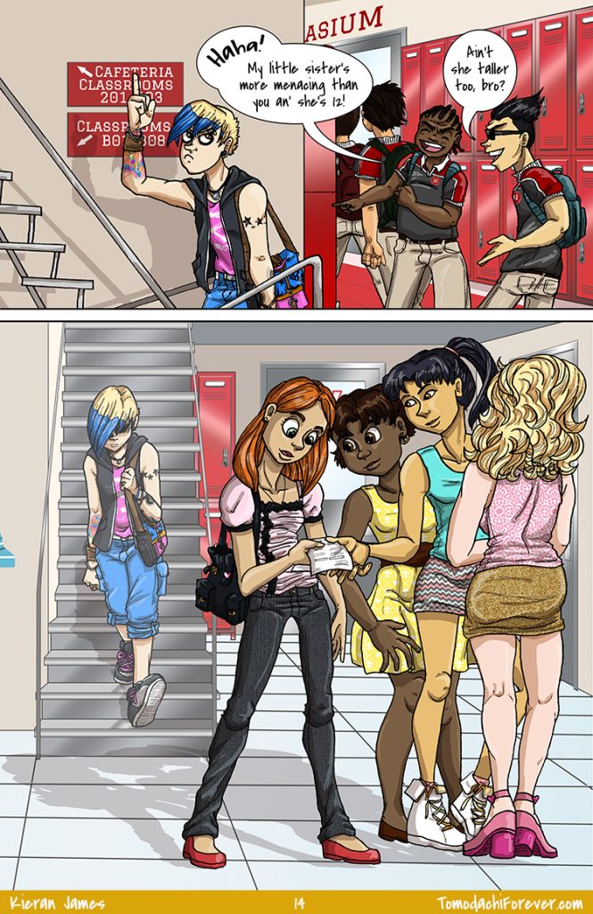
That’s it. My next high school comic will have everyone homeschooled! No more endless background figures to draw and color. Also, they’ll never leave the house so there will only be one set of backgrounds too.
I’m sure it’ll be a big hit.

The amount of redrawing this page required is kind of pathetic. Just Kate in panel 4 took THREE separate tries before I was remotely happy with the lineart, and I wouldn’t say it’s great or anything as is.

There’s a lot of flipping the bird in this comic, now that I think about it.

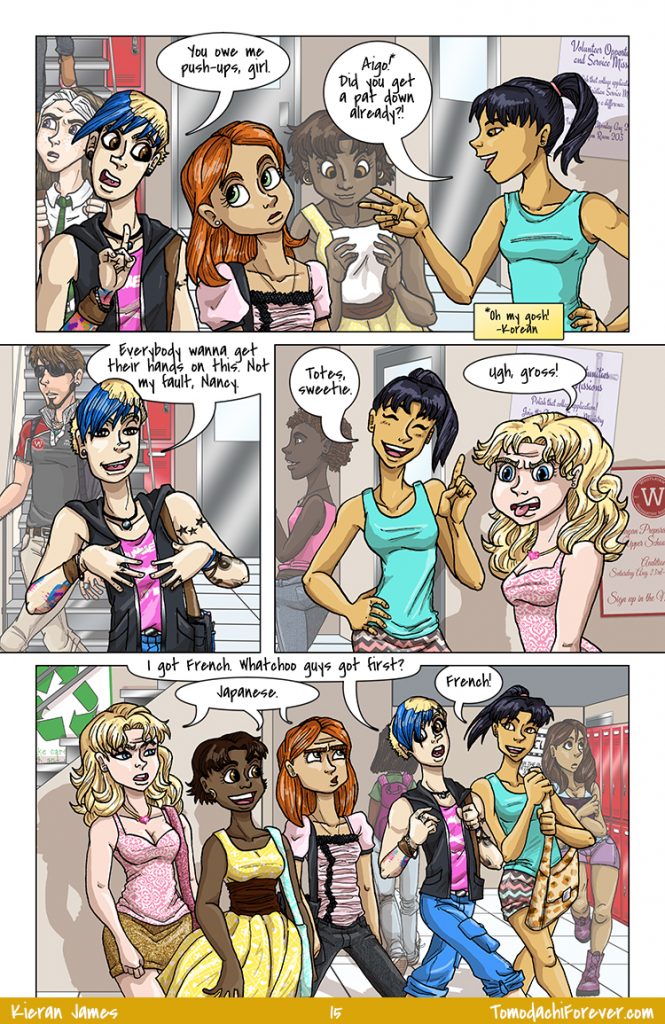
I originally wrote Nancy’s exclamation in Hangul since Korean uses a non-romanized alphabet, but I think this is probably more correct for comic format? I’ve asked a couple of copy editors I know, so feel free to weigh in if you’d like.
Oh, and here’s a little bit on Aigo:

I’m super happy with the shadows on this page! I’m no lighting expert but I work to learn something new with every page, so it’ll get there. I changed up my shading technique as well to save time. I was clinging to my old school “pick a shade for every base color and have 5 total shades and spend forever meticulously shading everything” because I love how vibrant it looks, but this is good too. And I did wind up editing some of the shading, like on the blond/e hair (both Kev and Amanda) and on the darker skin tones (Devin and Maddy, I can’t recall if I had to adjust Nancy’s highlights as well. Nancy is Asian and she’s got that rich coloring too).
I’ve also been playing with the “puppet warp” option in Photoshop CC. I was using CS2 for the last, oh…. FOREVER. This puppet warp thing is AMAZING. You can see an example of it on Nancy’s skirt (with the multi-colored chevrons). It makes it so much easier to warp patterns around clothing wrinkles and I’m just in love. I use it sometimes on the tattoos, like with Kevin’s forearm in the bottom panel since it’s twisted. Actually, his arm is probably turned too far out at the elbow, but whatever. Now we get to see more of that awesome tattoo. …and maybe he’s, like, double jointed?
